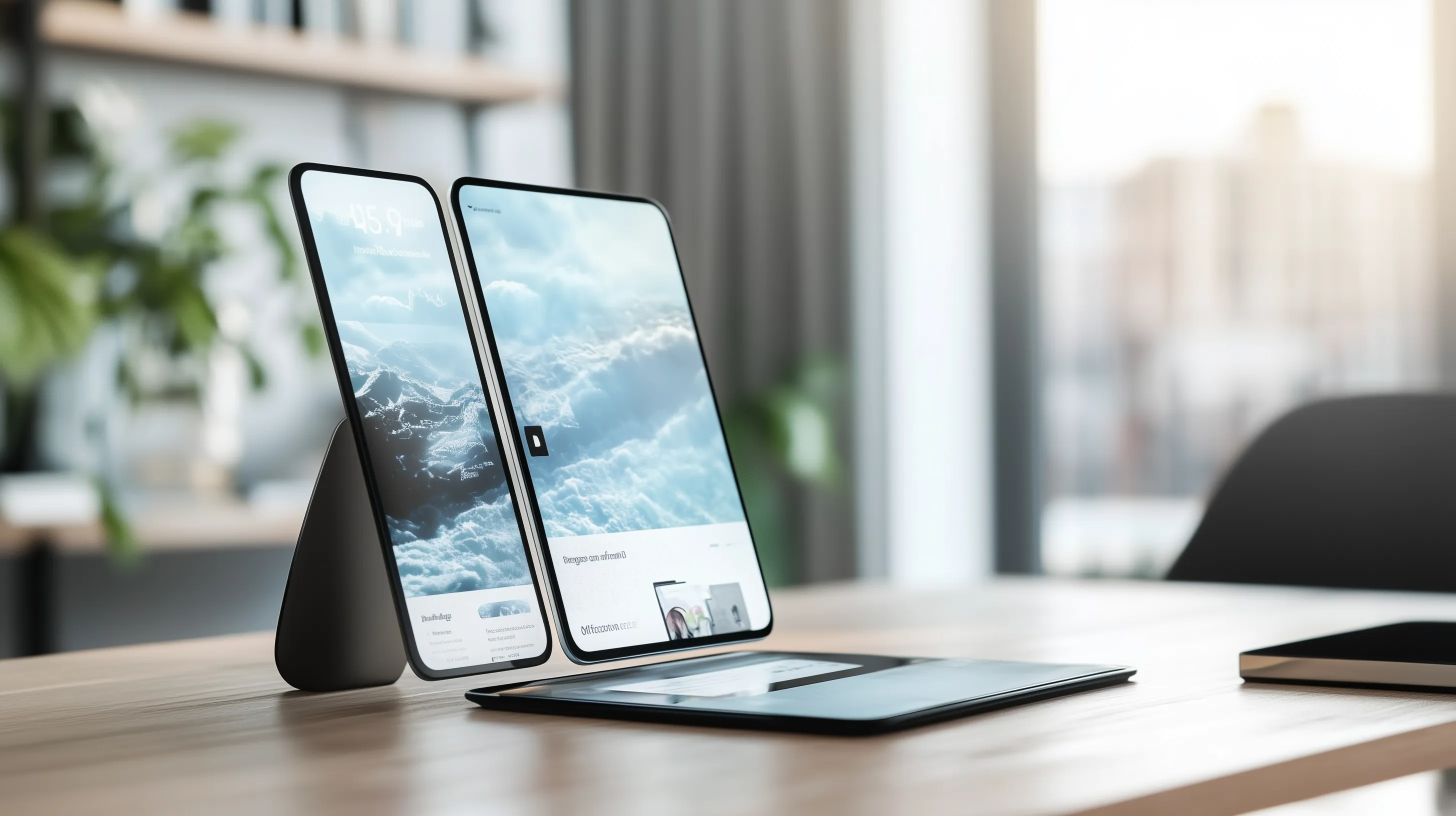
Foldable devices are revolutionizing mobile technology. With devices like the Galaxy Fold and Surface Duo, new possibilities for user experience emerge, but they also present challenges for designers and developers. This article explores CSS Device Posture, a feature designed to address these challenges, and how it brings innovation to web design.
What Is CSS Device Posture?
CSS Device Posture allows you to adapt your designs to the physical state (or "posture") of a device. It’s particularly useful for foldable or dual-screen devices, providing insights into how the device is being used.
For example:
- The device might be fully open and flat (flat).
- It could be folded, splitting the screen into two sections (folded).
- Or it could be positioned like a laptop, with one screen acting as a display and the other as a keyboard (laptop).
This enables you to optimize the user experience based on the physical configuration of the device.
Why Does It Matter?
Modern websites and applications must not only adapt to different screen sizes but also to how devices are physically used. CSS Device Posture is critical in scenarios like:
-
Foldable Screen Experiences:
Foldable devices have a hinge that splits the screen into two areas. One side can display navigation, while the other shows content. -
Adapting to Device Types:
It offers a standard for quickly adapting to diverse hardware, such as dual-screen devices, foldable displays, or even future flexible screen technologies. -
User-Centered Design:
Structuring user experiences around a device's posture creates more intuitive and efficient interactions.
CSS Device Posture States
Currently, the following three posture states are defined:
-
Flat:
The device is fully open with no hinge or fold affecting the display. This is ideal for full-screen experiences. -
Folded:
The screen is divided by a hinge. You can design layouts where one screen serves as a menu while the other displays the main content. -
Laptop:
The device is partially folded, resembling a laptop. One screen is used for display, while the other might act as a keyboard or control area.
How to Use It
You can use @media queries in CSS to target a device's posture and adjust your designs accordingly.
@media (device-posture: folded) {
  .left-panel {
    width: 50%;
  }
  .right-panel {
    width: 50%;
  }
}

@media (device-posture: flat) {
  .layout {
    display: grid;
    grid-template-columns: 1fr;
  }
}
This example demonstrates how to offer different layouts based on whether the device is folded or flat.
Where CSS Device Posture Is Useful
This feature is particularly valuable in:
- Foldable Devices: Utilize split screens effectively when a hinge divides the display.
- Dual-Screen Devices: Manage content flow across two screens.
- Future Technologies: Prepare for flexible screens and other devices that might change their physical shape.
Conclusion
CSS Device Posture enables designers and developers to understand and adapt to a device's physical state. Optimizing user experiences based on device configurations helps you stay ahead of the curve and prepare for future technologies.
If you’d like to learn more or need support implementing this in your projects, feel free to reach out. We’d be happy to help!
“Writing is seeing the future.” Paul Valéry

