

Table of Contents
- User-Centered Design: The Foundation of Successful Websites
- Simple and Understandable Interface: Avoid Mistakes That Lose Users
- Fast Loading Pages: The Impact of Performance on UX
- Mobile Compatibility (Responsive Design): Don't Ignore Mobile Users
- Effective Navigation: Make It Easy for Users to Navigate
- Attractive and Useful Calls to Action
- SEO-Friendly Design: The Strong Connection Between UX and SEO
- Confidence-Inspiring Design Elements: Gain Users’ Trust
- Conclusion: The Contribution of User-Centered Design to Web Success
Share
In the digital world, the success of a website is directly related not only to its aesthetic appearance, but also to its success in user experience (UX) and user interface (UI) design. Today, internet users prefer websites that respond to their needs in the fastest and most efficient way. At this point, adopting a user-oriented approach becomes one of the most important elements that allow brands to gain a competitive advantage.
UX and UI design are critical components that determine how a website interacts with its visitors, how it makes them feel, and how it guides them. While UX covers the overall experience users have during their time on the website, UI refers to the visual and interactive elements that make up this experience. A user-friendly design is not just about providing an aesthetic layout; it also encourages visitors to easily access the information they are looking for, navigate through pages effortlessly, and perform targeted actions (purchase, registration, form filling, etc.).
Having a successful UX/UI design not only increases visitor satisfaction, but also significantly affects businesses' conversion rates. A user-friendly interface is one of the most effective ways to build customer loyalty and increase brand credibility. Fast-loading pages, intuitive navigation, eye-catching calls to action (CTAs), and an accessible design will keep visitors on your website for longer.

However, UX and UI are of great importance not only to users but also to search engines. Google no longer ranks solely on keywords and links; instead, it considers metrics such as the time users spend on a website, bounce rate, and page experience. Websites that optimize user experience gain the advantage of increasing their organic traffic by ranking higher in search engines. For example, a mobile-friendly and fast website ensures that users stay on the site and achieves a better position in Google’s ranking algorithms.
In short, UX and UI optimization in web design is much more than satisfying users; it means more traffic, higher conversion rates, and a sustainable digital presence for businesses in the long term. In this article, we will take a closer look at the basic principles of user-centered web design, ways to create a successful UX/UI strategy, and Epigra’s approach in this area.
User-Centered Design: The Foundation of Successful Websites
The success of a website in the digital world is directly related to how well it meets visitors’ expectations. User-centered design is not limited to creating a visually aesthetic site; it also means understanding the needs of users, identifying possible problems they experience, and offering the most effective solutions to them. When a website is not designed in accordance with the wishes of its target audience, it can lead to users leaving the site quickly and high bounce rates. Therefore, it is necessary to always put the user experience at the center of the design process.
Analyzing user needs is one of the cornerstones of a successful UX design. Without understanding who the users who visit your website are, what their motivations are, and the challenges they face, it is not possible to offer a design that meets their expectations. Various methods can be used to determine user needs. For example, user opinions can be obtained directly with surveys and feedback forms, and user behavior on the site can be observed with heat maps and click analysis. This data makes design decisions more conscious and makes it possible to create a structure that directly meets the needs of users.
Creating a design that meets visitor expectations by establishing empathy is one of the most important elements of a user-centered approach. Good UX design creates a direct journey in the minds of visitors. When users visit a website, they want to achieve a specific goal: to obtain information, access a service, or purchase a product. Ensuring that users complete this process as effortlessly, quickly, and pleasantly as possible is one of the most effective ways to keep them on your site. Clear and intuitive navigation, clear directions, and a clutter-free interface help users reach their goals as quickly as possible.
However, user experience is not a static process; it should be constantly tested and open to improvement. At this point, A/B tests and user research** play a critical role in improving website performance. A/B tests help determine which versions of certain page designs, button placements, or call-to-action elements (CTAs) are more effective. Regular testing to understand which design layouts users respond more positively to provides data-driven optimization.
In conclusion, user-centered design is much more than a random aesthetic arrangement. Understanding the needs of the target audience, optimizing their experience through empathy, and making improvements through continuous data analysis form the basis of a successful website. A website that puts the user at the center not only attracts more visitors, but also ensures that users form a strong bond with the brand and become loyal customers.
Simple and Understandable Interface: Avoid Mistakes That Lose Users
The success of a website depends on how users interact with it and how easily they navigate. Creating a simple and understandable interface is critical to increasing the time users spend on websites, guiding them correctly, and increasing conversion rates. Complex and unnecessary design elements can distract visitors and make it difficult to reach the information they want. Therefore, minimalism, clarity, and user-friendly interactions should be at the forefront of web design.
Advantages of Minimalist Design
Based on the principle of simplicity, minimalist design eliminates unnecessary visual elements and distractions, allowing users to focus on the main content. Users generally do not want to see a complex structure on your site; what they need is to be able to reach the information they are looking for quickly and easily. Unnecessary decorations, too much color use or excessive animations can negatively affect the user experience.
The main advantages of a minimalist web design are:
- Fast Loading Time: By eliminating unnecessary images and heavy graphics, the website loads faster. This also provides an advantage in terms of SEO, as Google also considers page speed to be an important ranking factor.
- Focused Content Presentation: Simplicity allows users to focus on the main content without distraction.
- Easy Navigation: Users can intuitively understand menus and directions, so they can quickly find the information they are looking for.
Providing Clarity by Avoiding Complex and Unnecessary Elements
A common mistake on websites is to overwhelm the user with information overload. If a visitor cannot quickly understand what to do or how to access the information they are looking for when they enter your site, they will most likely leave. Therefore, the following elements should be taken into consideration during the design process:
- Use a Consistent Design Language: Provide a consistent experience for the user by using similar fonts, color palettes, and iconography on all pages.
- Avoid Unnecessary Animations: Animated elements and effects can tire the user when overdone. If an animation is used, it should only be for important elements that need to be noticed.
- Pay Attention to the Use of White Space (White Space): Leaving enough space on the page makes it easier to perceive information. Designs that are too cramped and dense with content can visually tire the user.
- Keep Menus and Categories Short and Concise: Complex menu structures and navigations that include too many categories can cause users to get lost. Make navigation easier by keeping main headings and submenus simple.
User-Friendly Form Designs and Interactive Elements
One of the most interacted sections on websites is forms. Interactive areas like contact forms, signups, or checkout pages are essential components that help users complete their goals. However, poorly designed and complicated forms can discourage users from filling out the form and reduce conversion rates.
Here are some things to consider when creating a user-friendly form design:
- Avoid Unnecessary Fields: Only ask for the information that the user really needs. Forms with too many input fields can cause visitors to leave without completing the form.
- Use Clear and Comprehensible Labels: Users should be able to clearly understand what information they need to enter. Make field names and placeholders descriptive.
- Provide Autocomplete and Validation: Help users minimize errors by providing autocomplete or error messages for information like email addresses and phone numbers.
- Be Mobile Friendly: Make sure forms work well on all devices. It’s important to provide large buttons and keyboard optimization for mobile users.
In conclusion, simplicity and clarity are the basis of creating a successful web design. In order for users to easily navigate the site, consume content quickly and perform the desired operations effortlessly, it is necessary to make the interface as clean, understandable and intuitive as possible. By eliminating unnecessary elements, offering user-friendly interactions and adopting a minimalist approach, you can ensure that users stay on your website longer and reach their desired goals more easily.
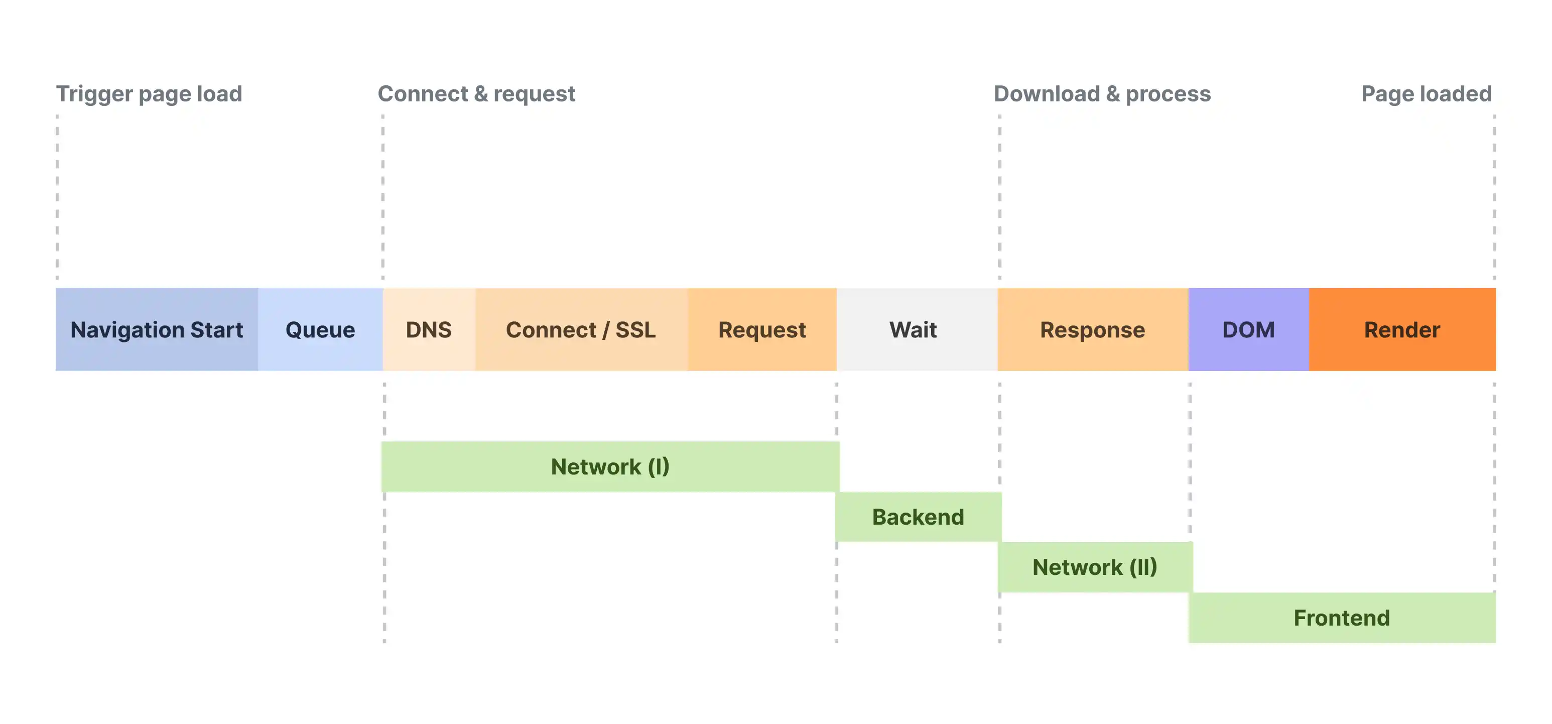
Fast Loading Pages: The Impact of Performance on UX
In today's internet world, speed is one of the most critical factors determining the success of a website. Users no longer tolerate waiting; if pages do not load in a few seconds, they immediately go to another site. According to research conducted by Google, when the page load time increases from 1 second to 3 seconds, the bounce rate increases by 32%. When it reaches 5 seconds, this rate can reach 90%. Therefore, website speed is of great importance not only in terms of user experience (UX) but also in terms of SEO performance.
A fast-loading website allows users to spend more time on the site, access content quickly, and increase conversion rates. On the other hand, slow-loading pages can cause both loss of visitors and low rankings in search engines. Since Google considers speed to be an important ranking factor, page loading time also directly affects organic traffic.
The Impact of Page Speed on SEO and User Experience
The benefits of website speed in terms of both SEO and user experience are as follows:
-
Better Search Engine Rankings: Google prioritizes fast-loading websites and determines rankings by measuring page performance with Core Web Vitals metrics.
-
Lower Bounce Rate: Users don't like to wait on slow-loading pages and abandon the page. Fast-loading sites retain visitors for longer.
-
Higher Conversion Rates: When users have a fast shopping and browsing experience, they are more likely to make a purchase or fill out a form.
-
Strengthening Mobile User Experience: Today, a large portion of internet traffic comes from mobile devices. Fast-loading pages optimized for mobile users increase overall user satisfaction.
Optimization Techniques to Increase Website Speed
Various optimization techniques can be applied to increase page speed. These include strategies to improve both front-end and back-end performance.
1. Reduce Loading Time by Compressing Images
Large images on websites are among the factors that directly affect loading time. The following methods can be used to reduce the size of images:
- Prefer JPEG and WebP formats: Use lighter, quality-preserving formats instead of heavy file formats like PNG.
- Use Lazy Loading: Speed up by ensuring that only the visible images are loaded when the page opens.
- Use compression tools: Compress images with tools like TinyPNG, ImageOptim, and Squoosh to reduce their size without losing quality.
2. Use CDN (Content Delivery Network)
A content delivery network (CDN) distributes your website content across servers located in different geographical locations, ensuring that the content is served from the server closest to the user. This greatly improves page load time. Popular CDN services include Cloudflare, Akamai, and AWS CloudFront.
3. Remove Unnecessary Code and Heavy Scripts
Your website’s HTML, CSS, and JavaScript files can contain unnecessary lines and unused code. To remove this unnecessary code, you can apply the following techniques:
- Minimize code: Compress your HTML, CSS, and JavaScript files to remove unnecessary whitespace and comments. Tools like UglifyJS, CSSNano, and HTMLMinifier can be used to do this.
- Combine JavaScript and CSS: Reduce HTTP requests by combining multiple CSS and JavaScript files.
- Remove unused plugins: Especially for CMS platforms like WordPress, you can increase site speed by removing unnecessary plugins.
4. Use Browser Caching
Caching prevents visitors from having to re-download previously loaded page resources. This significantly reduces page load time.
- Use server-side caching: Speed up database queries with caching systems like Redis or Memcached.
- Configure browser caching settings: Reduce load time by enabling the browser to cache static files like CSS, JavaScript, and images.
Google’s Core Web Vitals Metrics and Speed Optimization
Google uses three core metrics called Core Web Vitals to measure user experience and determine rankings:
- Largest Contentful Paint (LCP): Measures how long it takes for the main content of a page to load. Google recommends an LCP time of under 2.5 seconds.
- First Input Delay (FID): Measures the difference between the user’s first interaction and the browser’s response time. The FID time should be under 100 ms.
- Cumulative Layout Shift (CLS): Measures the shifting and visual instability of elements as the page loads. It is recommended that the CLS value be under 0.1.
To optimize for these metrics:
- Load the main content of the page first.
- Speed up page engagement by reducing JavaScript execution time.
- Make sure that images and ad elements have fixed height and width values.
Conclusion
Page speed is a critical factor for user experience and SEO success. Keeping users on your website is possible by providing them with a fast and smooth experience. You can increase your page speed and make it compatible with Google's Core Web Vitals metrics with techniques such as optimizing images, using CDN, removing unnecessary code, and caching. In this way, you can create a website that both pleases your visitors and achieves high rankings in search engines.
Mobile Compatibility (Responsive Design): Don't Ignore Mobile Users
Today, a large portion of internet traffic comes from mobile devices. The rapid increase in smartphone and tablet use has made mobile compatibility (responsive design) in web design no longer an option, but a necessity. When users access a website from different devices, they expect the content to be compatible, readable, and usable. If a website offers a bad experience on mobile devices, visitors will quickly leave the page, which increases the bounce rate and negatively affects SEO performance.
Taking this changing user behavior into account, Google has implemented the mobile-first indexing strategy. This strategy means that Google evaluates the mobile version first when determining its rankings. In other words, websites that are not mobile-friendly both lose users and fall behind in search engine rankings.
Mobile compatibility not only ensures that the page is displayed properly on mobile devices, but also improves the user experience and increases conversion rates. Let's consider an e-commerce site: A mobile-incompatible page creates great frustration for users who cannot easily browse products or find the purchase button, and negatively affects sales.
Increase in Traffic from Mobile Devices
The rapid increase in mobile device usage has completely changed web design strategies. Here are some striking statistics:
- Approximately 60% of global internet traffic comes from mobile devices**.
- 57% of users say they abandon a mobile-incompatible website**.
- According to Google’s research, mobile-friendly websites get 67% more conversions.
This data shows that mobile compatibility is critical not only for user experience but also for business growth.
Basic Principles of Mobile-Friendly Design
Certain principles need to be followed for a successful responsive design. The following elements should be at the forefront when creating a mobile-friendly website:
1. Use Flexible Grid Systems
To design a mobile-friendly website, flexible grids should be used. These systems allow websites to be resized ratio-based according to the screen width. For example:
- Instead of traditional pixel-based designs, percentage (%) values should be used.
- A flexible structure can be created with grid-based frameworks such as Bootstrap or Tailwind CSS.
- Column structures should be sized differently for desktop and mobile.
2. Adapt to Devices with Media Queries
In CSS, media queries can be used to make arrangements suitable for different screen sizes. For example, while a three-column design is used on a large desktop screen, these columns can be arranged one below the other on mobile devices.
A sample CSS media query:
@media (max-width: 768px) {
    .menu {
        display: block;
    }
    .content {
        flex-direction: column;
    }
}
Thanks to these types of queries, the website can dynamically adapt to any screen size.
3. Design for Touch User Experience
Mobile users navigate by touching, not by mouse. Therefore, the design should be finger-friendly:
- Buttons (CTA - Call to Action) should be large enough and easy to click (minimum 48x48 pixels).
- Menus and forms should be optimized for easy use on small screens.
- Pop-up and modal windows should be designed so that they do not disturb the user on mobile screens.
4. Optimize Images and Videos
In order to provide a fast-loading website on mobile devices, images and videos should be optimized.
- Do not use unnecessary high-resolution images; instead, prefer lightweight file formats such as WebP format.
- Use responsive images so they can automatically scale to the screen size.
- Use lazy loading technique for videos.
5. Pay Attention to Mobile Content Readability
On mobile devices, users avoid reading long paragraphs. So:
- Use short paragraphs and make the text more readable.
- Make headings and subheadings (H2, H3) clear and understandable.
- Make font sizes mobile-friendly (e.g. at least 16px).
Google’s Mobile-First Indexing Policy and Its Effects
Google has started using the mobile versions of websites as a ranking factor with its Mobile-First Indexing policy.
Effects of Mobile-First Indexing on SEO:
- Google scans the mobile version first and determines the ranking accordingly.
- If your website does not have a mobile version, your search engine ranking may be negatively affected.
- Mobile-friendly sites have higher click-through rates (CTR) and users spend more time on the site.
For a website suitable for mobile-first indexing:
- Make sure your mobile version has the same content and metadata as the desktop version.
- Test your mobile speed and optimize page load time.
- Check your website performance with the Mobile-Friendly Test.
Conclusion
Mobile compatibility has become one of the most important elements of modern web design. Most users now access websites via smartphones, and Google also uses mobile compatibility as a ranking factor.
In order to create a successful responsive design, it is necessary to pay attention to factors such as flexible grid systems, media queries, touch-friendly interfaces, and content readability. In addition, creating a structure that complies with Google's Mobile First Indexing strategy will increase your SEO performance and ensure that your website ranks higher in search engines.
A mobile-friendly website is not just a trend, it has become a must. If your website is still not mobile-friendly, it may be inevitable that you will lose users and fall behind in Google rankings.
Effective Navigation: Make It Easy for Users to Navigate
Navigation plays a critical role in the success of websites. When users enter a website, they want to reach the information they want quickly and effortlessly. If a visitor gets lost between pages, cannot find what they are looking for, or the navigation structure is confusing, the bounce rate increases, which negatively affects both user experience (UX) and SEO performance.

Good navigation guides the user, makes them spend more time on the website and increases conversion rates. For example, if an e-commerce site does not offer easily accessible category menus and intuitive filtering options, users cannot find the product they want and may turn to competitor sites.
So, what are the best methods for creating user-friendly navigation?
Intuitive and Simple Menu Design
Menu designs that offer an intuitive experience for users make website navigation more comfortable and understandable. Here are some basic principles for an effective menu design:
- The main menu should be clear and concise: Save users from unnecessary complexity with 5-7 main categories. Too many menu items can create confusion.
- Drop-down menus should be used carefully: Instead of deep hierarchical structures, create simple and easily accessible menus.
- Mobile-friendly navigation should be provided: User-friendly options such as hamburger menu or bottom navigation bars should be offered on mobile devices.
- Prioritize important pages in the menu: For example, essential pages like “About Us,” “Services,” “Products,” or “Contact” should be easily accessible.
A sample minimalist menu structure:
Home | About Us | Services | Blog | Contact
Using Breadcrumbs to Help Users Quickly Find What They Are Looking For
Breadcrumbs (Content Path) are a navigation element that helps users understand which page they are on and easily return to previous pages. It is especially useful for e-commerce sites, blogs and multi-page corporate websites.
Using Breadcrumbs:
-
Offers a hierarchical structure: Users can quickly see their current location and return.
-
Contributes to SEO: Search engines understand your site's internal link structure by reading the breadcrumb structure.
-
Improves user experience: Users do not need the browser back button to return.
Example breadcrumb structure:
Home > Categories > Digital Marketing > SEO Guide
This structure clearly shows where the user is, while also facilitating access to other relevant pages.
Website Linking and User Redirection Strategies
Internal linking is a technique that creates links between pages on a website to direct users to specific content. It is a critical method for further browsing and displaying content that is relevant to users' needs.
Effective internal linking strategies:
1. Use Meaningful Link Text
-
Create link text that clearly tells the user what they will find.
-
Use descriptive links such as “SEO Strategies Guide” instead of “Click here”.
Example:
“Read our SEO-Friendly Performance Optimization guide to increase your website speed.”
2. Link Related Content
-
In a blog post, encourage readers to stay on the site longer by recommending other related content.
-
For example, in a UX/UI article, link to related content like "Mobile Friendly Guide" or "Using Color in Web Design".
3. Redirect to Pages That Convert
-
Create strategic internal links that direct users to services, products, or demo pages.
-
For example, you can reach potential customers by linking to your service page from your blog content.
Example:
"Optimize your website with our professional UX/UI services."
Conclusion
An effective navigation structure allows users to move comfortably on your website and quickly reach the information they are looking for. Simple and intuitive menus, breadcrumb usage and internal links improve user experience, reduce bounce rates and strengthen SEO performance.
By enabling users to easily navigate your website, you can ensure that they spend longer on the site, interact more with content and increase conversion rates.
Attractive and Useful Calls to Action
**The correct use of CTA (Call to Action) on websites is one of the most important elements that direct visitors to the desired action. A CTA button should contain clear and guiding messages such as "Buy Now", "Get a Quote", "Try It Free". However, not only the text of the CTA, but also its design, position and color have a great impact on user experience.
A well-designed CTA should guide the user in an encouraging way without being annoying and should be easily noticeable on the page. A poorly positioned or unobtrusive CTA can seriously reduce conversion rates.
CTA Button Design and Color Usage
The design of the CTA should grab users’ attention, but it should also be compatible with the overall aesthetic of the page. Color choice plays a critical role here. For example:
- Red or orange CTAs create a sense of urgency and encourage action.
- Green and blue CTAs convey a sense of trust and are especially preferred in the finance or technology sectors.
- Contrasting colors make the CTA stand out from the background and make it more visible.
A well-designed CTA should stand out, but it shouldn’t be too aggressive or over the top.
Clear and Concise User Guide
CTA text should give the user a clear message that tells them exactly what to do, rather than vague directions like “Click here”. For example:
Incorrect: “Send”
Correct: “Sign Up for a Free Demo”
Incorrect: “Learn More”
Correct: “Download a Free Guide”
The language of the CTA should make the user feel like they’re offering a direct benefit. Phrases like “Don’t Miss Out”, “Get Started Now”, “Try Your First Month Free” can drive more engagement.
Action-inducing Micro Copy and A/B Tests
To increase the success of CTAs, it is important to add micro copy and test different versions. Micro copy is small informative texts that are placed immediately around the CTA button and provide additional details that convince the user.
Example:
The following micro copy can be added under the “Sign Up Now” CTA:
"No credit card required, try it free for 14 days!"
"Sign up now, get 20% off!"
In addition, it is necessary to conduct A/B tests to measure the effectiveness of CTAs. It is possible to determine the highest conversion option by testing different button colors, texts and placements.
Result
A successful CTA is an element that directs the user without disturbing them, attracts visual attention and gives a clear message. With color selection, positioning and strong microcopy, CTA buttons can significantly increase your website’s conversion rates.
An effective CTA should be created not only in terms of design, but also by understanding the user’s psychology and expectations. With the right strategies, it is possible to attract visitors’ attention and direct them to the desired action.
SEO-Friendly Design: The Strong Connection Between UX and SEO
User experience (UX) and SEO are two inseparable parts of a successful website. Google’s algorithms now place great importance not only on keywords but also on how users spend time on websites, their interactions between pages, and the length of time they stay on the site. A good UX is a critical factor that directly affects SEO rankings.
Search engines reward fast, user-friendly, and accessible websites. Users being able to easily find the information they are looking for will ensure that they stay on the site for longer, while a low bounce rate will increase the value of your site in Google’s eyes.
The Importance of Title Tags, Meta Descriptions, and URL Structure
To design an SEO-friendly website, it is necessary to pay attention to on-page optimization rules. In particular, title tags, meta descriptions, and URL structure play a major role in both user experience and search engine rankings.
- Title Tags (H1, H2, H3…): Should clearly summarize the content of the page and include keywords.
- Meta Descriptions: Should be descriptive and original, encouraging the user to click. Google may change irrelevant or incomplete meta descriptions as it determines, so well-optimized descriptions are essential.
- SEO Friendly URLs: Short, understandable and keyword-containing URLs should be created. For example:
example.com/p=1234
example.com/seo-compatible-design
Well-structured titles, meta descriptions, and URLs make it easier for users to understand the page and help search engines index your content better.
The Importance of Content Readability and HTML Semantics
Google’s page experience updates show that readable and organized content ranks better. Users may quickly exit the page when faced with large, congested blocks of text. For this reason:
- Short paragraphs and bulleted text increase readability.
- Keyword usage should be natural, and excessive keyword stuffing should not be used.
- HTML semantics (tags such as article, section, header, aside) clearly explain the structure of the page to search engines and increase accessibility.
Additionally, schema markup (structured data markup) can be used to help Google better understand the content. For example, marking up data such as price, availability, and user reviews for a product page with schema markup makes it possible to get more eye-catching snippets in search results.
Conclusion
SEO and UX are two powerful strategies that complement each other. A user-friendly website not only provides a better experience for visitors, but also helps Google reward your website.
Adhering to SEO rules such as title structures, URLs, content readability, and semantic HTML usage, while providing a fast and effective user experience will increase both your website's SEO and conversion rates in the long run.
Confidence-Inspiring Design Elements: Gain Users’ Trust
The success of a website is not just about aesthetics and functionality; gaining users’ trust is the key to creating loyal customers in the long run. Today, people want to feel safe when sharing their personal data, shopping online, or signing up for a service. Therefore, it is very important for your website to have confidence-inspiring elements.
Security measures determine how trustworthy your website is in the eyes of users. Using an SSL certificate, offering secure payment options, and taking a transparent approach to protecting personal data reduce visitors’ hesitations. Google also rewards sites that prioritize security; websites that are not protected with the HTTPS protocol may now receive a “Not Secure” warning, causing users to avoid it.
In addition, user reviews and social proof play a critical role in building trust. People attach great importance to the opinions of people who have previously experienced that site or service. Making positive user feedback visible on your website can positively affect new visitors’ decisions to purchase or request a service. For example, real customer reviews added to product pages make users feel more secure.
Another way to create a reliable brand image is to use a clear, transparent and understandable communication language. Instead of complicated and vague expressions, explanations that guide users correctly, return policies, warranty processes and clear presentation of contact information reinforce the sense of trust.
As a result, the trustworthiness of a website is a critical factor that ensures users stay on the site and increases conversion rates. With the right security measures, strong social proof and transparent communication strategies, you can increase users’ loyalty to your site.
Conclusion: The Contribution of User-Centered Design to Web Success
In today's digital world, a good website is not just about an aesthetic design. User experience (UX) and user interface (UI) are one of the most important factors that directly affect how visitors interact with a brand. A website designed according to users' expectations and needs not only pleases visitors, but also increases the brand reliability of businesses, increases conversion rates and creates loyal customers in the long term.
A user-centered web design increases interaction by increasing the time customers spend on the website. Thanks to a simple and understandable interface, fast-loading pages, mobile compatibility and reliable design elements, users can reach the information they want with less effort. As a result, users' trust in the website increases and they are more likely to perform conversion-providing actions such as making a purchase or filling out a form.
UX and UI optimizations not only improve the customer experience, but also directly affect SEO performance. Google rewards user-friendly websites and ranks them higher. Fast-loading pages, intuitive navigation, and readable content help search engines better understand your website and increase organic traffic.
As Epigra, we approach user-centered web design from a strategic perspective and aim to maximize user experience in every project. By conducting user research based on real data, we create conversion-oriented and modern designs that are suitable for the target audience of brands. The websites we have developed for businesses from many different sectors to date have resulted in high user satisfaction and successful conversion rates.
As a result, a good UX/UI design not only ensures that users interact better with your website, but also determines the success of your business in the digital world. A website created with a user-centered approach will be one of the most powerful tools that support both customer satisfaction and the achievement of your commercial goals.


“Writing is seeing the future.” Paul Valéry